Cropping Images with CSS While Keeping a Focal Point in the Center
Images can be an impactful part of web content, but providing images that fit every device, from small to large screens, can be quite a challenge.
Fortunately, the web platform offers several solutions for adjusting images to different screen sizes, including resolution switching and art-direction.
However, there are times when cropping an image on the client side is necessary, especially when the image needs to fit into a dynamically sized container.
To crop an image effectively, it’s important to prioritize a specific part of the image and preserve the essential content around it. One way to achieve this is by identifying the image’s “focal point” – the part of the image that is most important – and cropping the image around it.
In this post, I’ll walk you through my technique for cropping images with CSS while preserving the image’s focal point.
I’ve tried to describe all steps thoroughly, but if you prefer you can skip directly to the TL;DR.

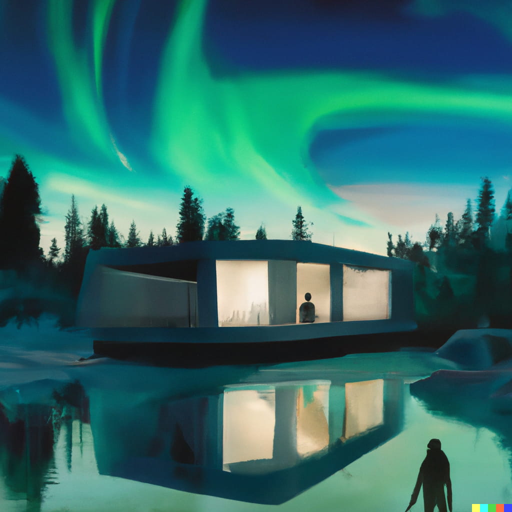
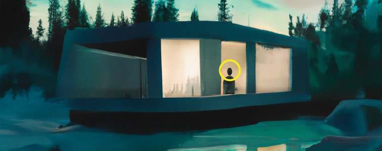
Illustration: Created with the assistance of DALL·E 2
Use client-side cropping sparingly
While client-side cropping can be an effective way to adapt images further for display on different screens and devices, it can also be a wasteful technique. The downside of cropping on the client is that we discard pixels that we’ve spent resources on transferring and decoding. As a result we end up with larger file sizes, slower load times, and a less optimal user experience overall. As such, it’s important to use client-side cropping sparingly and consider alternative responsive image techniques.
The web platform offers a range of built-in solutions to optimize images for different screen sizes and devices,
such as srcset and sizes attributes and the <picture> element. If you’re not familiar with these solutions MDN has a great article on providing responsive images.
Fitting the image into specific dimensions
Let’s start by trying to fit an image into a 3 / 1 aspect ratio.
We can do this by declaring the aspect-ratio property on the image.
The image will adjust by stretching to fit its dimensions. This is not exactly what we want, but it is a step in the right direction.
width: 100%;
aspect-ratio: 3 / 1;
Maintaining the aspect-ratio of the image
To tell the browser how to resize the image to fit its container, we can use the object-fit property.
This property allows us to choose how the image should be scaled, using values like contain, cover, fill, none, or scale-down.
When we use the cover value, the image is scaled to fill the container while preserving its natural aspect ratio.
width: 100%;
aspect-ratio: 3 / 1;
object-fit: cover;
This is a step in the right direction, but there’s still an issue: the image is cropped towards the center, and not necessarily towards where our subject is placed.
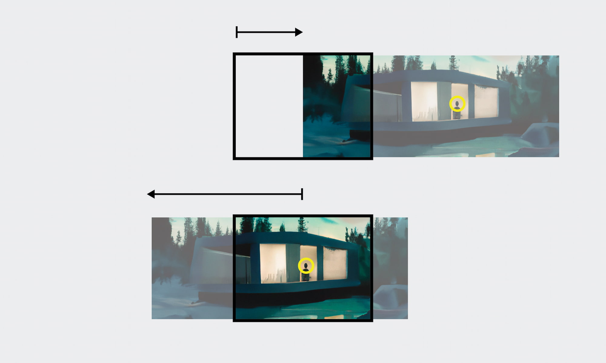
Adjusting the position of the image
To address the issue of the image being cropped towards the center,
we can use the object-position property in CSS to reposition the image within its container.
Initially, we’ll hand-tune the value of this property to achieve a better crop.
To ensure that the repositioning works across different screen sizes,
we’ll use relative units like <percentage> values instead of absolute units like pixels.
A value of 0% aligns the start edge of the image with the start edge of the container,
while a value of 100% aligns the end edge of the image with the end edge of the container.
When using a two value syntax with percentage values, the horizontal position is declared first followed by the vertical position.
Let’s say, for example, that we want to reposition an image so that its subject is in the bottom left corner of the container.
We could use a value of 0% 100% for the object-position property to achieve this.
For our example a value of 50% 62% seems to give suitable results:
width: 100%;
aspect-ratio: 3 / 1;
object-fit: cover;
object-position: 50% 62%;
Although hand-tuning the object-position property allows us to create a nice crop for the current dimensions, it’s not feasible to manually adjust the position for every image and every dimension. Instead, we need a more automated way to crop the image while preserving a focal point.
Setting a focal point
To define a custom focal point for cropping, we can declare custom properties like --crop-focus-x and --crop-focus-y,
and set these to values between 0 and 1.
Using <number> values makes it possible to perform mathematical operations with <length-percentage> values using calc() .
For example, as the subject of our image is placed at around 60% horizontally and 60% vertically, we can set the custom properties accordingly:
--crop-focus-x: 0.6--crop-focus-y: 0.6
While it’s possible to use the custom focus point directly in object-position,
you can see that the subject is not quite centered in the container.
In the next sections we will dive into why we can’t use the custom focus point directly,
and explore a better method of calculating the object-position so that the focus point is centered in the container.
--crop-focus-x: 0.6;
--crop-focus-y: 0.6;
width: 100%;
aspect-ratio: 3 / 1;
object-fit: cover;
object-position: calc(var(--crop-focus-x) * 100%) calc(var(--crop-focus-y) * 100%);
Why focus coordinates can not be used directly
To better understand why using focus coordinates directly in object-position doesn’t work,
let’s take a look at an example image with three positions marked out along the horizontal axis: 25%, 50%, and 75%.
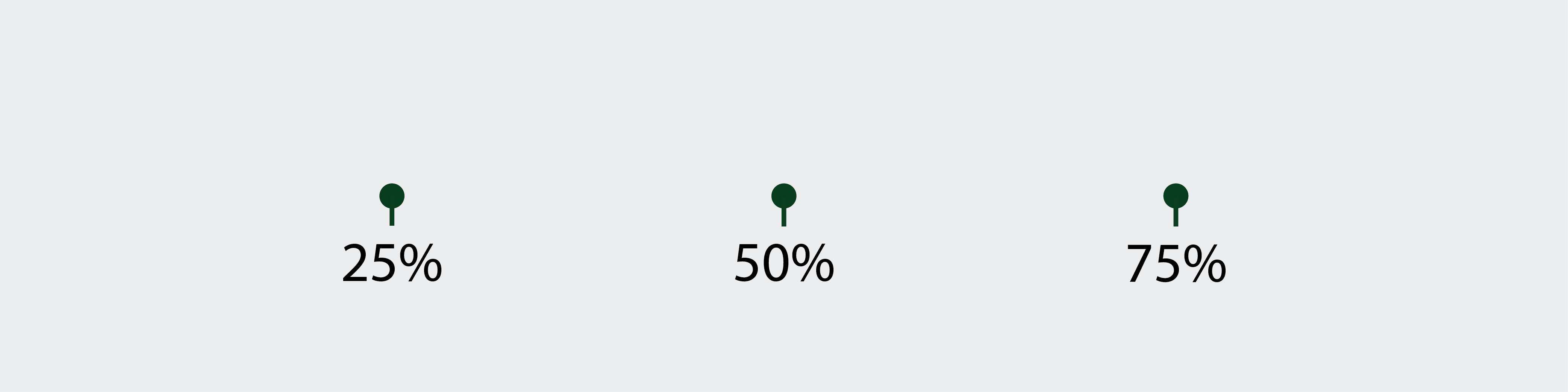
We can crop this image to a 1 / 1 aspect ratio and use the --crop-focus-x property to set the focus point to one of 0.25, 0.5, or 0.75.
Below is an interactive demo where you can choose between the three values for --crop-focus-x:
As you can see, when the focus point is set to 25% or 75%, the cropped image is off-center and the focus point is not centered in the container. This is not the behavior we want. Ideally, the cropped image should keep the focus point in the center. So what’s causing this behavior?
How percentage values in object-position work
Let’s take a closer look at how percentage values in object-position work.
According to the CSS Backgrounds and Borders Module Level 3,
the horizontal offset is calculated as a percentage of the difference between the width of the container and the width of the image,
while the vertical offset is calculated as a percentage of the difference between the height of the container and the height of the image.
In other words, if we have a container that is 200px wide and the image is scaled to be 300px wide, then a value of 100% will resolve to a used value of -100px.
You can read more about percentages on MDN.
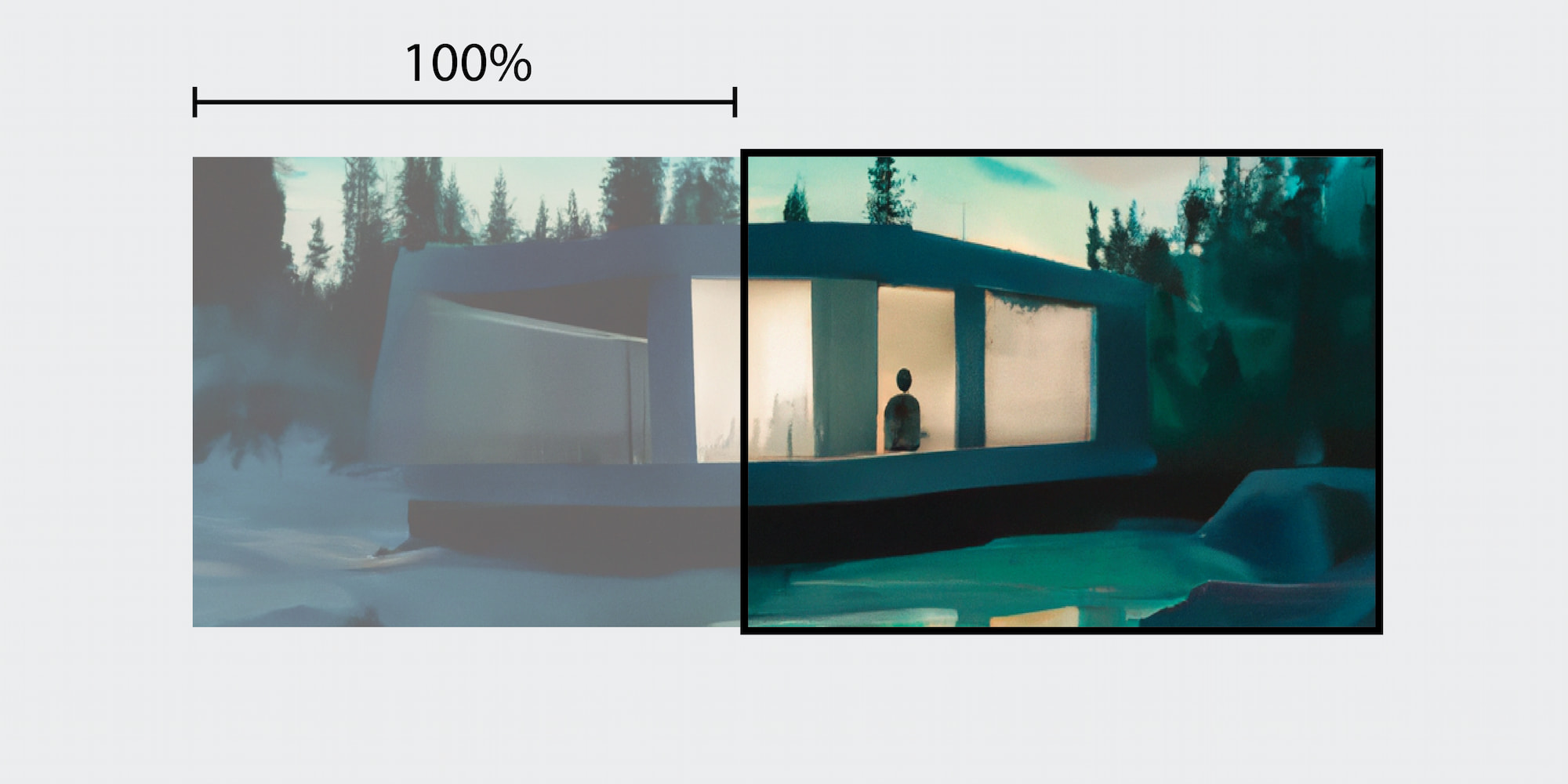
Illustration: Created with the assistance of DALL·E 2
This behavior is not a bug, but a clever feature of CSS.
For example, object-position: 0% center will align the image to the left border of the container,
while object-position: 100% center will align the image to the right border of the container.
As long as the author keeps the values between 0% and 100%,
it is not possible to “overshoot” the position of the image.
However, using percentages directly in object-position won’t help us achieve our goal of centering the focus point.
For instance, a declaration of object-position: 25% 0% means that a spot that is 25% from the left of the image will be placed 25% from the container’s left and not in the center.
This is not be the behavior we want, since the focus point will end up off-center as we saw in the previous section.
In the next section we will address the problem of calculating object-position so that the focus point is kept in the center.
Centering the focal point
To center the focal point in the container,
we need to calculate the appropriate object-position values.
Let’s focus on the horizontal dimension and break down the calculation into two steps:
- Move the left edge of the image to the center of the container
- Then move the image to the left so that the focal point is in the center of the container
Step 1
First we need to move the left edge of the image to the center of the container.
For now, we’ll assume that we know the width of the container, and store it in a custom-property called --container-width.
The amount we need to move can be calculated as 0.5 * var(--container-width):
--container-width: 250px;
object-position: calc(0.5 * var(--container-width)) 0%;
Step 2
Next, we need to move the image to the left so that the focal point is centered in the container.
To do this, we need to know the distance between the left edge of the image and the focal point.
We can calculate this distance by using the --crop-focus-x custom property and multiplying it by the width of the scaled image.
But first we need to figure out the size of the scaled image.
Remember how 100% corresponded to the amount difference between the image size and the container size? To find the width of the scaled image, we can simply subtract 100% from the container size:
--image-width: calc(var(--container-width) - 100%);To find the distance from the left edge of the image to the focal point, we simply multiply --crop-focus-x with --image-width.
Now we can subtract the resulting value from the value from the previous step to calculate the appropriate object-position:
--container-width: 250px;
--image-width: calc(var(--container-width) - 100%);
--crop-focus-x: 0.6;
object-position: calc(0.5 * var(--container-width) - var(--crop-focus-x) * var(--image-width)) 0%;
After updating the example from the previous section with the new calculation, we can see that the focus point centered in the container:
Illustration: Created with the assistance of DALL·E 2
These two steps ensure that the focal point is centered horizontally in the container.
To center the focal point vertically, we can follow the same steps, but use --crop-focus-y, --container-height and --image-height instead.
With these calculations, the focal point is centered both horizontally and vertically in the container.
--crop-focus-x: 0.6;
--crop-focus-y: 0.5;
--container-width: 250px;
--container-height: 250px;
--image-width: calc(var(--container-width) - 100%);
--image-height: calc(var(--container-height) - 100%);
object-position: calc(0.5 _ var(--container-width) - var(--crop-focus-x) _ var(--image-width))
  calc(0.5 _ var(--container-height) - var(--crop-focus-y) _ var(--image-height));
Preventing image edges from entering the container
When using focus points close to the edges,
we may run into the problem of the image edges entering the container.
To prevent this we can clamp the values of object-position between 100% and 0% using clamp().
For example, if we set --crop-focus-x to 0.0 the left edge will move all the way to the center of the container.
By clamping object-position between 100% to 0% we make sure the edges of the image doesn’t pass edges of the container.
object-position: clamp(
    100%,
    0.5 _ var(--container-width) - var(--crop-focus-x) _ var(--image-width),
    0%
  )
  clamp(100%, 0.5 _ var(--container-height) - var(--crop-focus-y) _ var(--image-height), 0%);
It’s worth noting that we clamp from 100% to 0% and not the other way around.
This is because 100% is a negative value representing the difference between the container width and the image width.
For example, if our container was 100px wide and our image 200px wide, then 100% would resolve to -100px.
By clamping between 100% and 0% we effectively keep the value between -100px and 0px.
If we clamped between 0% and 100% we would clamp between a minimum value of 0px and a maximum value of -100px.
Then the value would always be 0px and the image would always be aligned to the left edge of the container,
no matter where we put the focus point.
Container queries
Previously, we assumed we already knew how big our container was. This is fairly reasonable when the container is sized with media queries or according to some known dimension such as the viewport.
However, there are many cases where we can not reliably know the dimensions of the container upfront. For example, when the container is put in a grid or a flexbox, it might be resized based on the surrounding content.
Until now, there hasn’t really been a way to reliably know the dimensions of our container. But that has changed recently.
After Firefox 110 was released, all the major browser now support container queries. Container queries lets us define a containment context on an element, so that we can query the dimension of that context later.
If we put our image into another element we can make this element a containment context by setting container-type to size.
Then we can use container query length units to get the dimensions of our container:
.container {
  container-type: size;
}

img {
  --crop-focus-x: 0.6;
  --crop-focus-y: 0.5;
  --container-width: 100cqw;
  --container-height: 100cqh;
  --image-width: calc(var(--container-width) - 100%);
  --image-height: calc(var(--container-height) - 100%);
  object-position: clamp(
      100%,
      0.5 _ var(--container-width) - var(--crop-focus-x) _ var(--image-width),
      0%
    )
    clamp(100%, 0.5 _ var(--container-height) - var(--crop-focus-y) _ var(--image-height), 0%);
}Illustration: Created with the assistance of DALL·E 2
TL;DR
In case you found the above sections to tedious, and just want the solution I’ve summarized it here:
- Declare the desired focus point with
--crop-focus-xand--crop-focus-y. - Use
object-fit: coverto scale and crop the image to fit the container dimensions while maintaining its aspect ratio.. - Figure out the container size and store it as
--container-widthand--container-height. Use container query length units if necessary. - Use the container width to calculate the size of the resized image by setting
--image-width: calc(var(--container-width) - 100%)and--image-height: calc(var(--container-height) - 100%). - Figure out the length from the edge of the image to the focus point by multiplying
--crop-focus-xwith--image-width. Do the same for the vertical dimension. - The position can now be calculated as
0.5 * var(--container-width) - var(--crop-focus-x) * var(--image-width). - Clamp the final position between
100%and0%so that the edges of the image are not moved into the container.
Make sure you only use client-side cropping as a progressive enhancement, and that images are still usable in browsers where new technology like ´container queries´ are not supported yet.
.container {
  container-type: size;
}

img {
  --crop-focus-x: 0.6;
  --crop-focus-y: 0.5;
  --container-width: 100cqw;
  --container-height: 100cqh;
  --image-width: calc(var(--container-width) - 100%);
  --image-height: calc(var(--container-height) - 100%);
  object-position: clamp(
      100%,
      0.5 * var(--container-width) - var(--crop-focus-x) * var(--image-width),
      0%
    )
    clamp(100%, 0.5 * var(--container-height) - var(--crop-focus-y) * var(--image-height), 0%);
}Illustration: Created with the assistance of DALL·E 2